Category: Portfolio

Creative projects portfolio by Tesalonika Wibisono

  • In 1920, Karel Čapek coined the term “robot” to describe a mechanical working class—a dehumanized labor force devoid of dignity. Inspired by this concept and today’s rapidly evolving technology, Jobless Robot probes a critical question: What will we become when work is no longer central to our identity?

    Created as part of my MSc in Creative Robotics, Jobless Robot explores our fears and hopes in an AI-driven future. The installation prompts reflection on the societal shift as AI and robots advance from performing “dirty, dangerous, and dull” tasks to potentially replacing roles we once deemed irreplaceable. With Large Language Models and generative art tools transforming creative industries, we face an identity crisis: we’ve long tied our sense of self to productivity, career, and economic survival.

    Jobless Robot symbolizes our contemporary struggle—a reflection on the idea that we, like robots, are still struggling to find purpose beyond labor. But it also suggests a new possibility: Could the replacement of jobs by AI offer freedom to redefine our role in society?

    Through this project, I invite viewers to consider: What should be the role of robots in society? Which jobs should remain human? And what policies will support a post-work economy? Jobless Robot is a call to envision a world where human worth transcends productivity, and technology serves as a catalyst for exploring new identities.

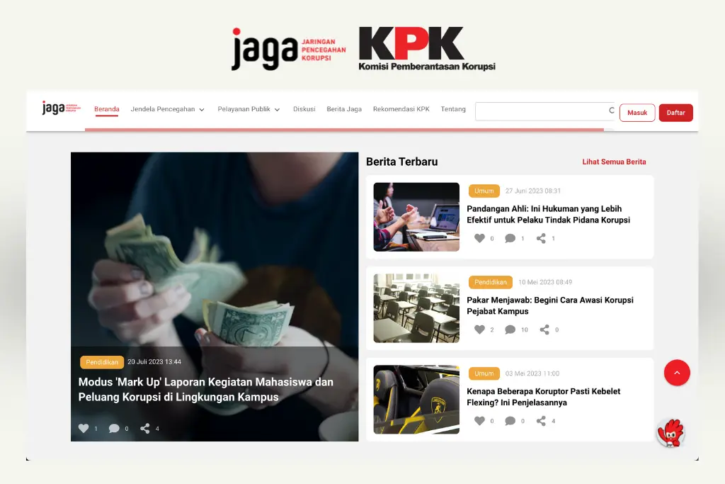
  • JAGA.id (Jaringan Pencegahan Korupsi) is a social platform made by KPK (Komisi Pemberantasan Korupsi) as a way to facilitate the Anti-Corruption movement in Indonesia. At JAGA.id, our BerJAGA (Berita JAGA) News Section plays a crucial role.

    As the Creative Communication Expert, I design this section to keep Anti-Corruption activists and the public updated on the latest news, HOW-TOs, and the progress of our Corruption Eradication Efforts across Indonesia.”

  • PT Nostra Aeterna Bene offers supply of goods and services, from 0 to 1, from A to Z. The company is build by combining more than 15 years of experience in their fields.


    Creative Director
    Tesalonika Wibisono

    Creative Designer
    Veronica Wangge

    Creative Writer
    Fadila Rana Laluna

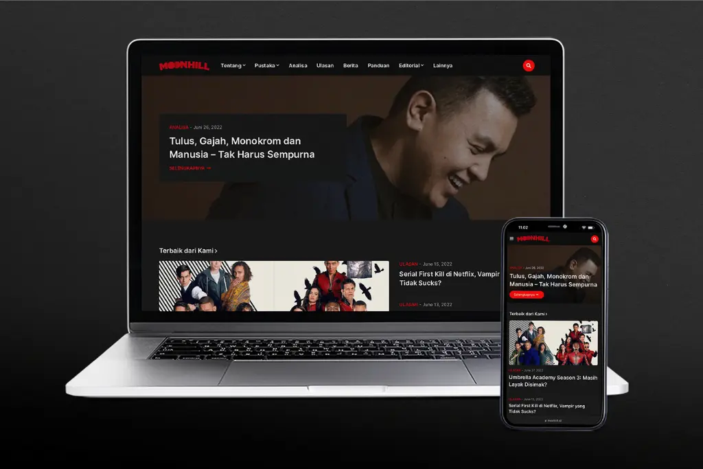
  • Moonhill is a community blog that consists of movie reviews, analysis, guides, news and trivia. Back in 2020, Moonhill focused on movie analyses and movie reviews. However, starting from 2021, Moonhill starting to expand. The contributor team is growing and they start to publish the various type of articles.

    Moonhill is using Blogger to host their articles. The previous post labelling system was too confusing for the new writers––to categorise their articles––and the top menu was not helpful for the readers to navigate the site. 

    I was challenged to make the menu for the visitor to find any information they need and make the labelling system simpler for the writers to categorise their articles.

    The goal of this revamp project is to empower users, both visitors and the contributor team.

    During the process, I proposed to migrate Moonhill to another CMS (Content Management System)––like WordPress––which has better categorising and labelling options. Unfortunately, the migration process was cancelled due to limited human resources and the need for technical efficiency. I scrapped the initial plan and rework the information structure.

    Based on experiments and feedback from beta users and the contributor team, I decided to separate the posts according to the type of articles, such as Wiki, for pillar articles––Review, Analysis, Editorial, News, Guide and Others for supporting articles. 

    These changes do not interrupt the SEO (Search Engine Optimisation) of the website but strengthen it in the long run.

  • Glints are looking for any undergraduate students and recent graduates who aspire to be top marketers through the Campus Ambassador program.

    Glints are looking for those who are active in campus organisations and have a wide network of contacts.

    The participants will be part of Glints marketing team as affiliate network at and outside the university to generate user leads and drive recruitment strategies.

    Initial Brief

    was to create a welcoming kit for participants of the program.

    The make over

    Since the participants are young university students and are active on social media, my idea was to create a cute and “less-boring” Welcoming Kit, that would them to share it on social media and going to enhance Glints ExpertClass brand awareness as a result. 

    We use vector illustration instead of simple shapes and typography. The faces are portrayed in various skin colours, cultural backgrounds, and personalities to symbolise the inclusivity of this program. 

  • Glints ExpertClass (GEC) is a program in open classes that aims to facilitate fellow students and young professionals to explore their potential and improve their abilities to support career development.

    The challenge of this project is how to portray the benefit of self-improvement classes. 

    So I came up with this idea…

    Using a metaphor or analogy

    like skincare products turns out to be beneficial for this direction as shown by high CTR (click through rate) and conversion.

    Exploration and A/B Testing for other class categories inspired by initial concept of skincare metaphor.

  • Ready to Work Festival 2021 is an event held by Glints ExpertClass where job seekers can improve their knowledge and skills in terms of preparing for the world of work by taking the classes provided.

    Initial Concepts. Brainstorming. Inspiration

    Brief Keywords: Futuristic, Minimalist, Professional

    Utilizing Glints’ super graphic as a gate & window for new opportunities as KEY VISUAL. The super graphic looks like Glass/Screen because this event will be conducted online and can be accessed through smart devices, so it looks like a Glass/Screen window or gate.

    Typography standpoint. “Up arrow” at the end of “Work” indicates: Upskilling, Upgrading, Be better, Leading, Expanding

    https://www.youtube.com/watch?v=euFCj2T1sx4

    Final Adjustments

  • Back in 2020, Moonhill.id was just a blog where moviegoers could find latest movie review and analysis.

    Managed by small group of people, Moonhill.id is here to spread the love of movies and storytelling for Indonesian audience.

    For the logo Moonhill.id use similar style to Netflix’s, because when Moonhill first began, they review (mostly) Netflix original series and movies. A bridge-like arc, also represents Moonhill values and mission.

    Ads-free and without click-bait articles, Moonhill will fund their future project with tip and donation from the readers. 

    Therefore there will be “Moonhill Premium” an exclusive paid-content in a format of electronic magazine, and “Moonhill Highlight” in-depth analysis of movies and storytelling related articles.